Pop-up stores have become an increasingly popular way for brands to connect with customers and offer a unique shopping experience. These temporary retail spaces are often crafted to be eye-catching and create a sense of exclusivity, but there is more to their design than just aesthetics.
The layout and design of a pop-up store can effectively tell a story and guide the customer on a one-of-a-kind journey through the space. A well-designed layout not only enhances the customer’s shopping experience but also creates a lasting impression that could potentially influence future purchasing decisions.
In this age of experiential marketing, brands understand the importance of creating an environment that engages customers and makes an impact.
If you are looking to craft a compelling brand activation experience through pop-ups, continue reading to explore the ways in which a pop-up store’s design and layout can influence customer behaviour.
Learn more: Brand Activation Ideas For Retail and Pop-Up Stores
1. Guide customers through a specific journey
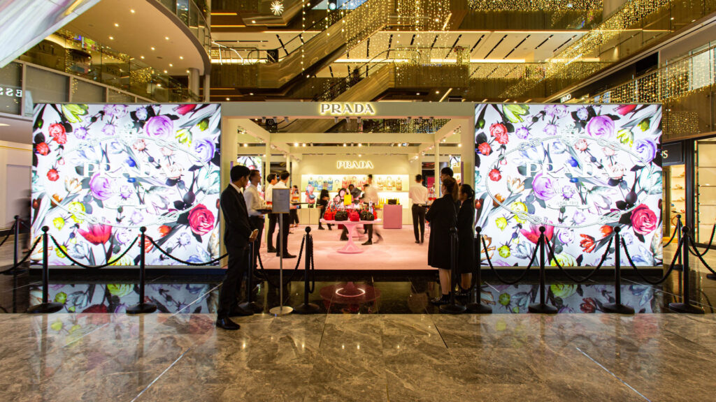
One of the primary goals of a pop-up store’s design and layout is to guide customers through a specific journey, leading them to discover new products and their features. The journey should begin with a clear and inviting entrance that captures the attention of passersby and entices them to step inside. Once inside, customers are greeted with a visually appealing and well-organised space that immediately communicates the brand’s identity and its values. This can be achieved through the use of bold colours, interesting textures and carefully curated visual merchandising displays.
As customers move through the store, they should ideally be guided towards specific areas with signages while lighting and other visual cues draw attention to the products and their key features.
This is demonstrated in the Prada Dreamscape pop-up where the layout and design of the store were thoughtfully designed to guide customers on a journey that highlighted the brand’s unique identity and values. The rosy pink carpet and floral motifs added a playful touch to the pop-up, creating a welcoming atmosphere that encouraged customers to explore the space. The product displays were also strategically placed to draw attention to key pieces and create a sense of excitement and discovery.
2. Create a sense of flow
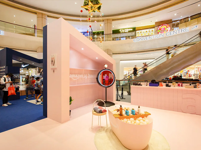
Putting more thought into the placement of products and displays of a pop-up store creates a sense of flow that motivates customers to move through the space and engage with the products.
One effective way is to design the store in a circular or zigzag pattern. This type of layout allows customers to move through the store in a natural and intuitive way, without feeling rushed or overwhelmed. Visual merchandising displays should be strategically placed along this path so that customers are exposed to the products and have a chance to discover new items they may not have considered before.
Using different types of lighting in different areas of the store creates depth and dimension that draw customers in and encourage them to explore.
The Amazon.sg House pop-up is an excellent example of how the strategic arrangement and thoughtful design of a pop-up store can influence customer behaviour. The space was created to mimic the layout of a real home, with different areas dedicated to specific functions. The reception area, living room, playroom, beauty parlour, reading area, and coffee corner were built to showcase different product categories and offer a seamless and enjoyable experience.
3. Create a sense of exclusivity
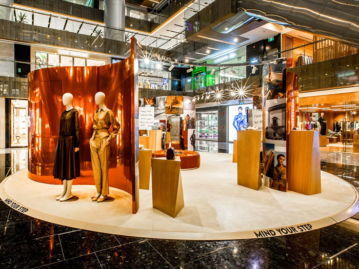
Featuring limited-time products in prominent locations within the pop-up store, such as near the entrance or part of a central visual merchandising display, emphasises their scarcity and encourages customers to make a purchase. Creating a sense of exclusivity builds anticipation and excitement around the pop-up store, driving more foot traffic and increasing sales.
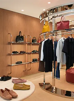
The Tod’s Spring/Summer 2023 Pop-Up did just that — it featured an eye-catching curved mirror design accompanied by ceiling track lights and a front-lit display of Tod’s iconic logo on the panels. The stunning backdrop enhanced the shopping experience by serving as the launching platform for the latest pieces from the Spring/Summer 2023 ready-to-wear collection.
Learn more: Myths and Misconceptions About Experiential Marketing
When it comes to creating an engaging and effective pop-up store, partnering with an experienced experiential marketing company in Singapore is key. The team at Dezign Format will guide you through the entire process, from conceptualisation to design, fabrication and project management. Get in touch with us today.


