The retail industry is undergoing major transformations as technology continues to advance and shape the consumer landscape dynamically. However, the primary objective of a successful retail strategy hasn’t changed: to deliver unique customer experiences through value-added touchpoints. According to a study by Deloitte, digital disruptions and economic challenges have disrupted retail stores consistently. However, it also serves to provide opportunities for brands to reinvent themselves creatively, finding ways to attract and retain their customers through both digital and physical activation means like creative pop-up store interior design and events.
Here is why strategic retail design in Singapore and visual merchandising display planning are still crucial. If you own a brick-and-mortar store, it is important to maximise the space available for visibility and engagement. Read on as we touch on important considerations and retail space interior design strategies that can help elevate your store’s presence and customer experience.
1. Curate A Cohesive Retail Design Layout And Seamless Experience Flow
A well-thought-out interior layout attracts traffic and influences customer behaviour. Creating a pleasant, comfortable, and curious environment naturally invites visitors to explore. When conceptualising the layout of retail space, there are 2 fundamental design principles that can come in handy:
- Allow ample space for exploration: Designating a retail space free from clutter and distraction at the entrance (also known as a decompression zone), is key to any store design and layout, as it allows customers to enter your business with a fresh mind, ready to shop and explore. Keeping your entrance minimal and clean will avoid overwhelming them upon entry too.
- Researchers have found that 90% of the population are right-handed. This means that the majority of the people will tend to gravitate towards the right side of a space subconsciously upon entering a store. Hence, it may be important to keep major products or major experiences of the store towards the middle or right side to make sure as many visitors get exposed to them as possible.
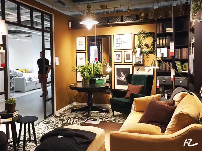
With these customer behaviour habits in mind, the interior layout curated for IKEA’s Tampines and Alexandra showroom was designed to capture shoppers’ attention from the moment they enter, a space to inspire them for their home design. Most products are arranged strategically near eye level to facilitate ease of interaction and engagement. Despite having many product displays and limited space, creative spatial arrangements were devised to ensure sufficient areas for movement and exploration, making every shopper feel curious and excited upon entering every turn.
2. Use Your Window Displays To Tell A Story
Window displays are more than just product showcases; they are one of the most effective marketing attraction points for retailers. The purpose of window and visual merchandising displays are to give customers a sense of what your brand identity is about and to showcase the highlights of your product and services. Beyond identity, brands can also use their window displays to engage with customers through stories by associating certain values and emotions to create a positive connection with the brand.
Visual merchandising display takes into consideration strategic placement and use of lighting, graphics, fixtures, product and colours to appeal to shoppers in a psychologically attractive manner. This encourages them to take a step closer and eventually, enter the store.
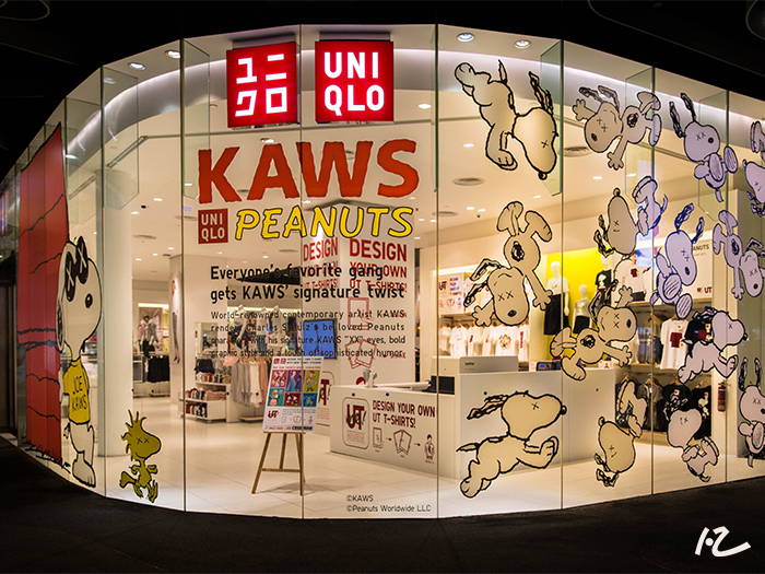
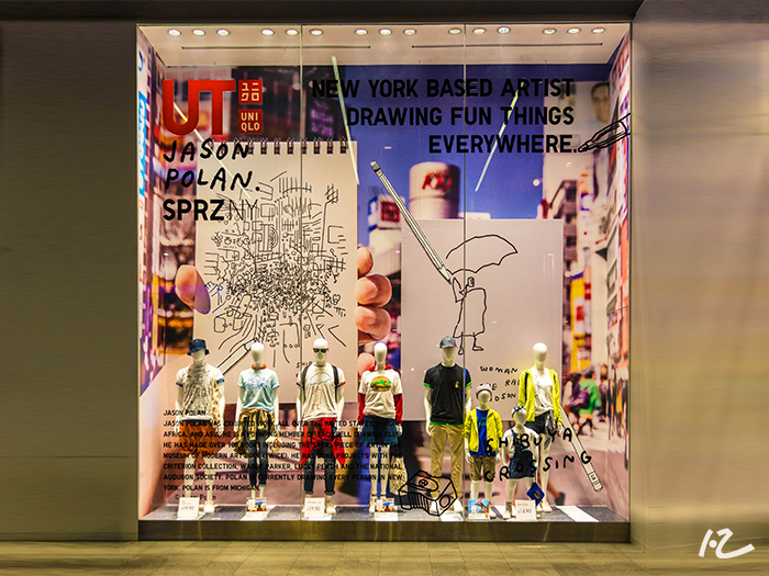
It is possible to have abstract and unusual themes to evoke curiosity other than just using products as attraction models. During the launch of Uniqlo’s Kaws X Peanuts Collection, we adopted the “order in chaos” concept where the models carrying the main products were lined up neatly in the window display, but the graphics creatives hung around them were in a more abstract manner. The use of bold fonts and illustration displays definitely piqued interest in some passersby.
In essence, window displays are not just important in retail space interior design but also pivotal in retail marketing. They showcase products while telling stories, evoking emotions, and creating memorable brand experiences. By leveraging creative concepts and strategic design elements, retailers can effectively engage customers and drive foot traffic into their stores.
3. Create a Focal Point In Your Window Display
As creative as we can be, it is still crucial to maintain a focal or main catch point in your display. Being able to blend your products seamlessly with your window display theme and drawing curiosity for shoppers to find out more about your product through certain key features will increase your store’s footfall.
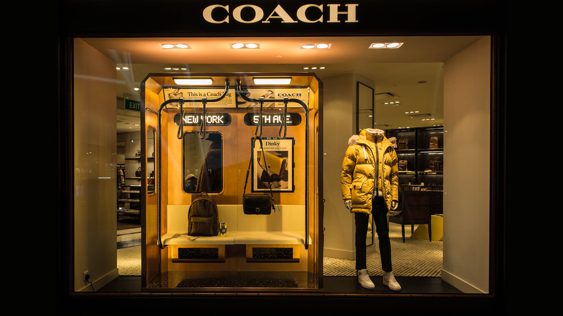
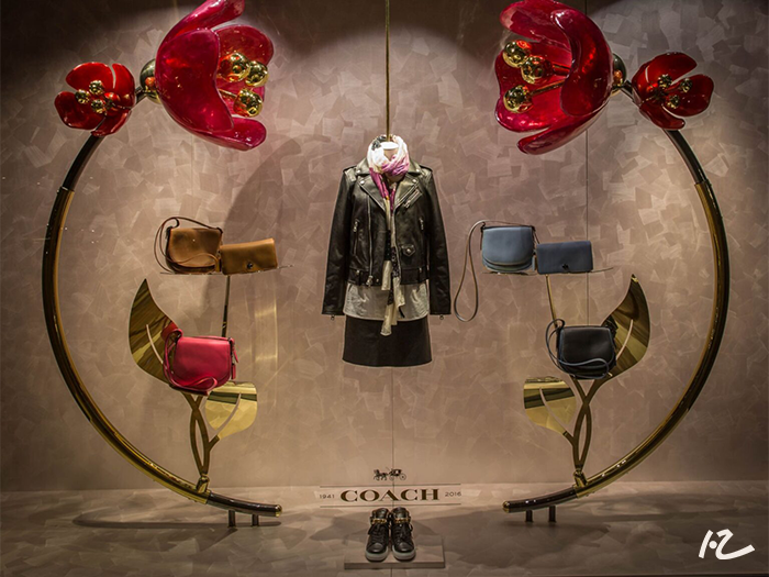
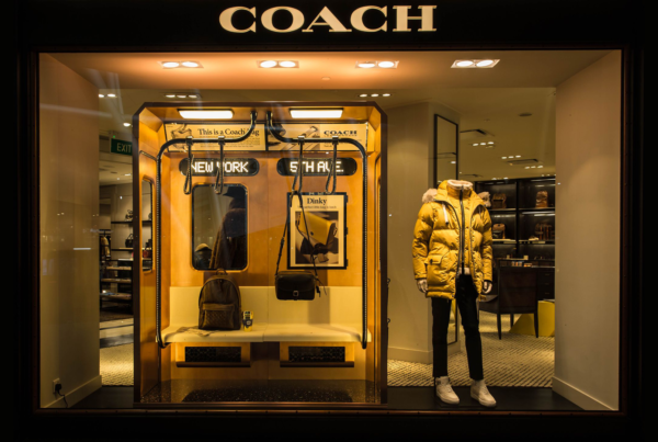
Taking COACH’s visual merchandising display seen above as a reference, the core focal display in the centre is strategically placed near the eye level with the other complementing products and elements pointing towards it. Even though the flower display elements at the side were huge, bright and attractive, they were shaped to point towards the middle to complement the focal display instead of overpowering it.
When it comes to retail design, remember to consider the placement and integration of various elements to create compelling window displays that not only attract but also retain customers’ attention, ultimately driving increased footfall into the store.
4. Align The Storefront Design With Your Brand Identity
In most cases, customers form an impression of a store by its window display or interior layout before making the decision to enter or walk away. With this in mind, it is critical to stand out against your competitors and neighbouring retail stores.
Creating a storefront that stands out helps establish a strong brand identity. Consistently refreshing your retail displays and layouts is one of the ways retailers can achieve that. It’s important to maintain brand consistency when refreshing displays as it creates a cohesive experience for both your existing and potential customers. By updating your window display design regularly with certain consistent elements in mind, you can keep your brand relevant to the season while ensuring lasting brand impressions.
According to American brand Lobo Mau’s designer, Nicole Haddad, it is important to update your visual merchandising and window displays every 2 to 3 weeks to prevent consumers from getting tired of viewing them, especially those who pass by everyday.
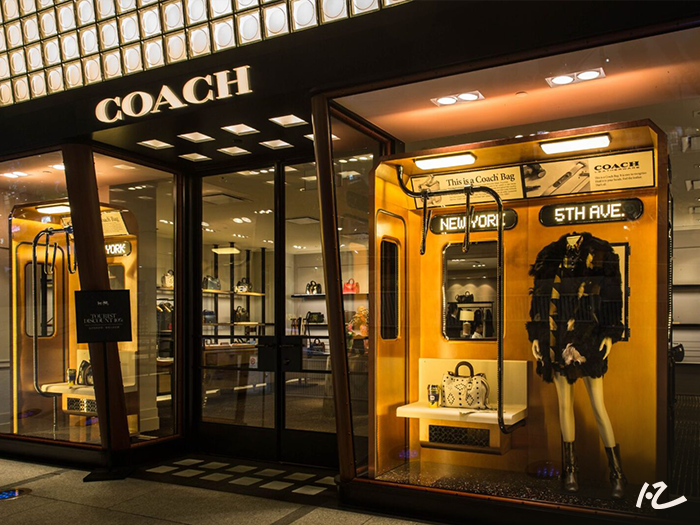
At ION Orchard’s Coach outlet, the New York subway cabins were replicated using rustic finishing, ensuring that even after the store closes, the window display continues to emanate street-style and realism. Our goal was to ensure that even with their New York street-style-inspired Fall/Winter collection, the storefront complements the brand’s elegance with the right lighting design and strategic visual merchandising display.
Maintaining a balance between consistency and creativity in your retail design, and regularly updating window displays enable you to create a strong and lasting impression. This approach not only attracts new customers but also keeps returning customers engaged, ultimately contributing to increased foot traffic and sales.
5. Engage Guests In Multi-Sensory Activities
A good way to get customers to browse in-store for a longer period is to engage them with some hands-on activities. Instead of overloading customers with product information, providing a multisensory journey will help them create an authentic connection with your brand. Let your customers have the opportunity to feel and experience your products firsthand and go another step further to personalise it. This will greatly increase brand interest and loyalty.
Finding ways to present your products in a unique and experiential manner can sometimes be challenging. Here are some ideas on how to engage your customers’ five senses:
- Hearing: Music influences how customers interact. Slow down their pace while browsing by using playlists with slower rhythm and softer beats. Excite them by using fast-pace music
- Sight: Utilise visual cues (lighting and colours) to direct your customers’ attention to certain products and displays.
- Touch: Consumers can feel and touch textures in stores. Place items within ease of reach and in their line of sight.
- Smell: There is a strong connection between smell and memory, which results in shoppers connecting with brands on an emotional level. One study found that scent marketing increased Nike customers’ purchase intent by up to 84%, indicating that scent marketing could have a powerful effect on consumer behaviour.
- Taste: Consider creating a seasonal sampling table especially if you sell food or drink products
Seasonal campaigns are a great way to keep things refreshing and interesting for customers.
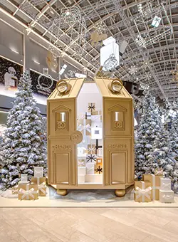
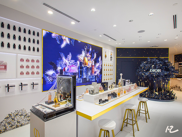
For instance, when celebrating the recent Christmas season, Dior’s Atelier of Dreams Collection took the spotlight. In tandem with the season’s aesthetics, the pop-up store interior design played tribute to the stylistic codes of the prestigious 30 avenue Montaigne façade, complementing the make-up products in unison. With an aura of conviviality and celebration, multisensory activities were also implemented to enliven the shopping experience and further heighten the festive spirit.
Here’s how they engaged their customers at the holiday pop-up store with multisensory activities:
- Custom Engraving Atelier: Guests get to choose the item they wish to engrave from a selection of fragrances and makeup collection completed with a personal message. Making gifts more personal will naturally encourage stronger emotions and connections.
- Rediscover Dior’s Signatures: From their floral bouquet fragrance J’adore to the highly coveted Rouge Dior lipsticks, guests can have their festive shopping list checked off easily as they enjoy a free luxurious beauty sampling session accompanied by demonstrations and detailed reviews guided by their staff. They were also given the chance to try out the Maison’s entire skincare and make-up collection – including the Rouge Dior lipsticks and the latest limited-edition holiday collection. Talk about generating excitement!
- If you are thinking about your next event, why not consider creating a pop-up store interior design that engages customers with hands-on activities and multisensory experiences? This approach can significantly enhance brand interest and loyalty while keeping the shopping experience fresh and exciting.
Leverage Retail Space Interior Design To Transform Your Retail Experience Today
Retail interior design is still core to a store’s success because a growing number of millennials express a desire for retail experiences, with 52% stating that they spend their money on experience-related purchases.
The best strategy is to turn your everyday items into a story or piece of art rather than just a product in your retail space. With more retailers redefining their window displays, the best way to stay ahead of the curve is to engage the right agency or design and build company that is experienced and versatile. With extensive experience in conceptualising and fabricating successful retail interiors and pop-up store designs, Dezign Format has a comprehensive understanding of industry expectations and dynamic seasonal turnovers.
View more of our retail space interior design projects here or contact our team today to find out more about our craftsmen who can transform your brand’s presence and retail customer experience!


