Retail fit-outs are an excellent way to revitalise your store and attract new and returning customers. A well-designed storefront has the power to enhance customer experience, improve sales, and build brand loyalty. However, creating a captivating retail store layout is an art that demands creativity and technical expertise. To achieve a fit-out that captivates and entices customers, you must first consider the pivotal elements and understand how to execute your strategy correctly.
1. Evaluate And Plan Your Layout
A thoughtfully-crafted store layout plays a significant role in guiding customers through the shop, encouraging exploration, and influencing what captures their attention. As such, think about what your customers want to see, touch, and experience when they enter your storefront. Identify all these elements and evaluate your store to see how you can incorporate them within your shop while ensuring everything is well-utilised within the space.
You can also consider seeking the expertise of a design and build company. Collaborating with a professional in this field can help bring fresh perspectives to your retail space design. The designers can contribute unique ideas and assist you in implementing the ideal installations that meet your specific requirements, significantly enhancing the success of your retail fit-out project.
2. Understand Customer Behaviour And Prioritise The Customer Journey
To design a captivating and functional retail space, it is essential to have a deep understanding of customer behaviour within your store. By conducting observational studies and analysing customer purchase patterns, you can identify hotspots where customers tend to gather, the path they follow while browsing your products, and the areas with the most foot traffic. With this information, you can strategically place high-margin or promotional products in prime locations as part of the retail design, capturing customer attention and increasing sales.
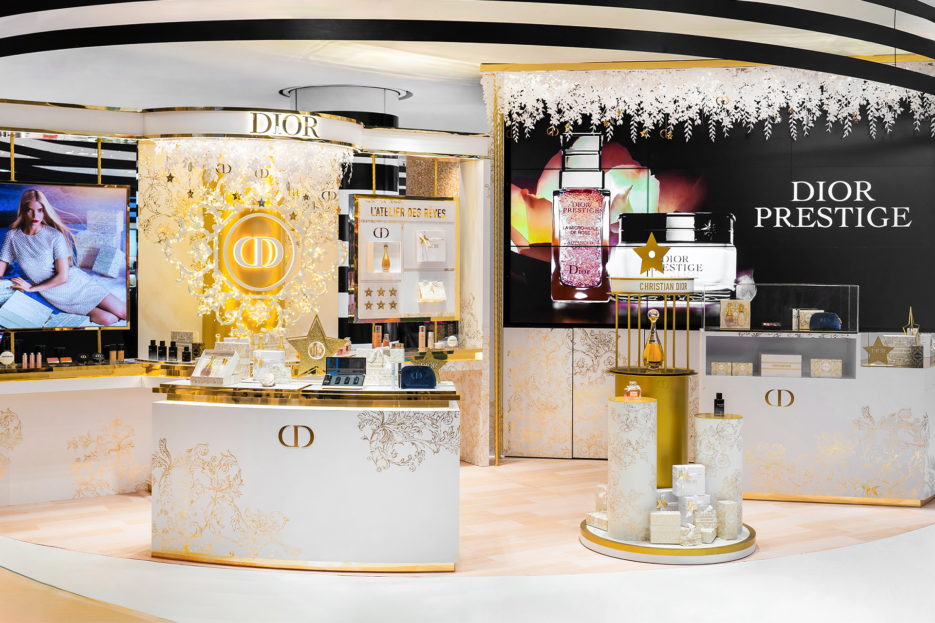
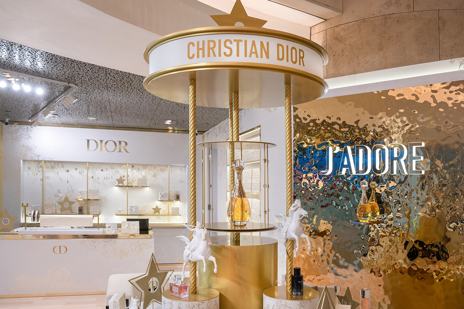
At Dezign Format, we specialise in customer-centric store designs. Take Dior’s permanent boutique at the heart of ION Orchard, which was exclusively dedicated to the brand’s bespoke products and personalised gift customisation services. As seen in the image above, every visual merchandising display element was crafted to foster an immersive and memorable experience, seamlessly integrating with the essence of Dior’s enchanting universe.
3. Aim To Create A Sensory Experience
A multi-sensory retail experience plays an equally significant role in a captivating retail design. Engaging customers’ senses, especially their sight, can leave a lasting impression, differentiating your business from your competitors. Attractive visual displays combined with soft music and pleasant scents can create an immersive environment, enticing shoppers to spend more time at the retail experience and browse your products.
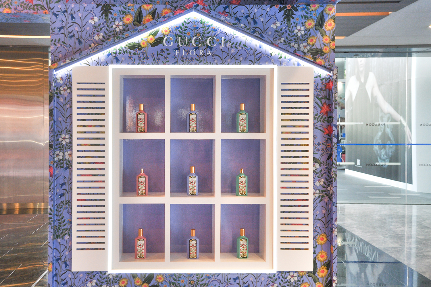
For instance, as part of the latest addition to Gucci’s #FloraFantasy fragrance collection, we worked closely with the brand to translate its campaign into a sensory brand activation experience. We crafted a pop-up adorned with vibrant shades of eccentric lilac and captured on a variety of surfaces and features.
To complement the dreamy floral wallpaper, the elevation panels were built with a solid finish to produce a contrasting effect between the surfaces, creating an immersive pop-up experience that drew consumers’ attention immediately. Featuring multiple touch points providing exclusive personalisation services and exquisite visual merchandising displays, customers were encouraged to explore every facet of the pop-up store.
4. Optimise Store Flow
The flow of your retail space also plays a pivotal role in shaping customer experience. You would want to strategically guide your customers through various sections, allowing them to effortlessly navigate around and browse through the plethora of products that you offer. Besides, observing how shoppers move and browse your products can increase the chances of them purchasing an item.
To optimise the store layout, you can consider the loop layout, where customers go through your store in a circular path, entering and exiting through the same route. This retail design encourages exploration, as customers are prompted to move through different sections. By strategically placing high-demand or promotional items along the pathway, you can capture consumer attention and entice more people to make purchases.
Alternatively, the grid layout works wonders for brands with an extensive inventory or a diverse range of product catalogues. It guarantees a well-organised shopping experience, providing customers with clear aisles that make navigating the area and finding what they need effortless. With clearly defined pathways, this ensures that customers can move seamlessly through your store, minimising frustration and confusion while enhancing efficiency.
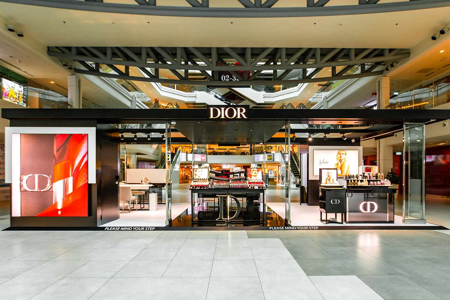
In fact, do not underestimate how a well-optimised, easy-to-navigate layout can impact the customer experience. As part of the launch of Dior Beauty’s pop-up concept store at Plaza Singapura, the brand activation featured an open layout plan, ergonomically integrating both visual merchandising displays and personalised consultation areas. With the displays on one side and the consultation counters on the other, customers could effortlessly browse the merchandise before heading to the other side of the pop-up store to try out a sample, preventing congestion in an otherwise limited pop-up retail space.
5. Employ Visual Merchandising Techniques
Arranging and presenting your products in a visually appealing and enticing manner can make a world of difference when attempting to drum up interest in specific merchandise or promotions. Visual merchandising techniques such as colour blocking, creating focal points, and ensuring eye-level displays, for example, can draw customer attention to your products.
Additionally, keeping shelves organised as well as maintaining a well-lit retail space with attractive signage can enhance the overall aesthetic appeal and shopping experience for your customers. By situating attention-grabbing displays at the end of an aisle, the likelihood of a consumer going over to browse the display and check out the aisle increases, elevating the chances of them making a purchase.
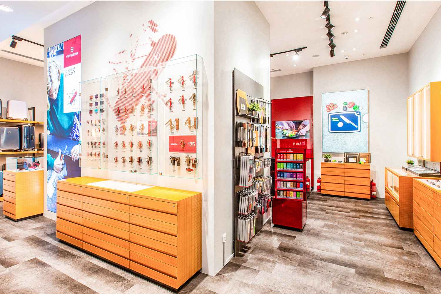
To take things up a notch, you can even consider personalised product display units to prominently highlight your merchandise. For the opening of the Swiss-founded global company Victorinox’s first flagship retail showroom in Singapore, we were appointed to fabricate the store’s retail fit-out along with custom-built cabinets to showcase its comprehensive selection of products.
Developed in line with the brand’s visual merchandising display guidelines across the world, our design concept featured the use of natural materials and refined details that reflected Victorinox’s effort in product sustainability, showcasing not just its merchandise but also the company’s values.
The ambience of your retail store can influence your customers’ experience. You would not want them to feel overwhelmed by your efforts. Instead, the aim is to make them feel comfortable in your store, which will encourage them to stay longer, thus increasing the chances of them making a purchase.
At Dezign Format, our experts specialise in a variety of retail space and pop-up store interior design, crafting design concepts that embody both functionality and creativity. Contact us today to learn how we can help transform your retail customer experience!


