In today’s competitive retail industry, creating a visually stunning store is no longer enough to attract and retain customers. Retailers must also ensure that their stores are functional and practical for both customers and employees. This is where the art of retail interior design comes into play.
Balancing form and functionality in retail interior design is a critical process as the perfect balance makes a big difference between a successful retail store and one that struggles to captivate customers. A space that is not just beautiful but also functional can have a significant impact on the customer experience and perception of the brand.
Keep reading to explore the intricacies of striking the right balance between form and functionality, and how it can enhance the overall appeal of a retail store.
Learn more: Retail Interior Design and Visual Merchandising Display Considerations
1. Consider customer needs
Customers are the backbone of any business, which is why considering the customer’s needs is crucial when it comes to retail interior design. Customers expect an experience that is both enjoyable and convenient when they walk into a store, and it is paramount to deliver just that.
Ensuring customers’ comfort should be a priority — the temperature of the store should be kept at a comfortable level that encourages customers to stay longer, background music should be played at a volume level that allows for easy conversation without being overpowering, and adequate seating should be provided to give customers a chance to rest and take a break from browsing.
Accessibility is another essential factor to consider — the store should have enough space for customers to move around freely and the layout must be easy to navigate. Retailers can also consider installing features such as wheelchair ramps and handrails to make the store more accessible.
Customers also expect to have a seamless shopping experience, from finding what they need to completing their purchases. Hence, the store’s layout needs to be intuitive with easy-to-find product categories and clear signage. Checkout should also be quick and efficient, with adequate registers and self-checkout counters.
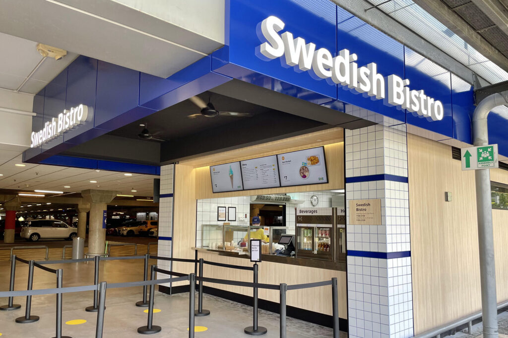
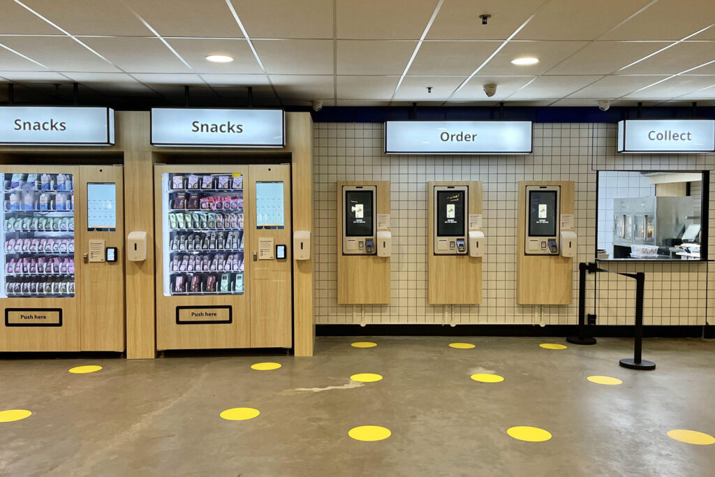
The IKEA Tampines Bistro is an excellent example of a retail interior design that has been thoughtfully curated to cater to customer needs. One of the most striking features is the white-tiled and maple wood interior finishing, giving the bistro a clean and modern feel. The counters and service kiosks were also designed to be functional, with overhead signage decked in IKEA’s iconic blue shade, making it instantly recognisable from the entrance or exit. The bistro’s grab-and-go concept was specifically designed with convenience in mind — several self-service kiosks were set up throughout the space, allowing shoppers to order and collect their food and drinks quickly and efficiently.
2. Optimise store layout
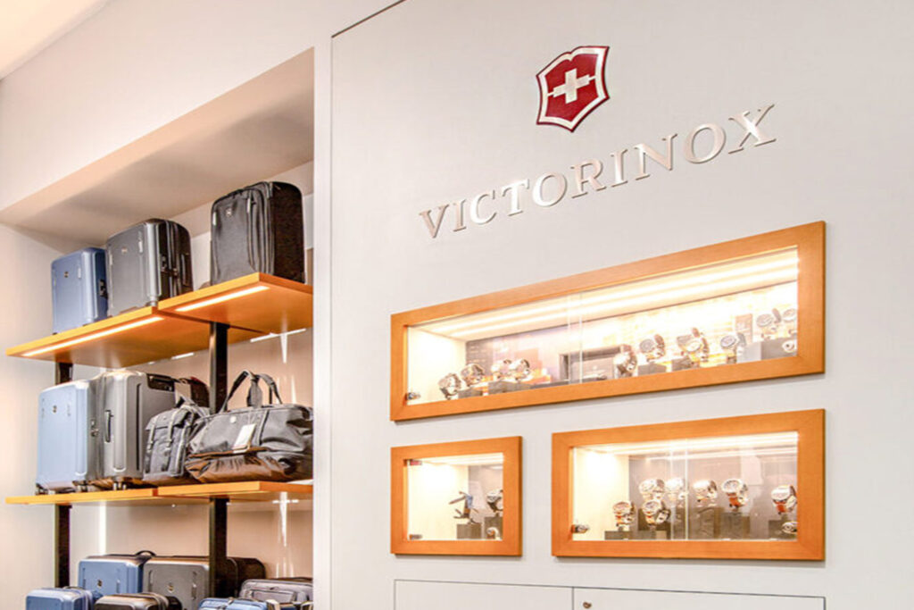
A well-designed layout creates a pleasant and engaging shopping experience that motivates customers to explore the space and make a purchase. Customers should be able to find what they are looking for quickly and easily without having to search for too long. This can be achieved through various elements in retail interior design, such as having prominent signage, clear product labelling and open pathways.
Another key aspect of store layout optimisation is ensuring that the space is easy to navigate. Customers need to be able to move around freely without feeling cramped or blocked. Thus, strategically placed displays and product fixtures with ample space between them are important to avoid clutter.
A store’s layout should also encourage customers to explore the space — visual interest such as window displays, focal points and interactive displays are some great examples. These elements not only create a more engaging shopping experience, but also help to showcase products and draw attention to specific areas of the store.
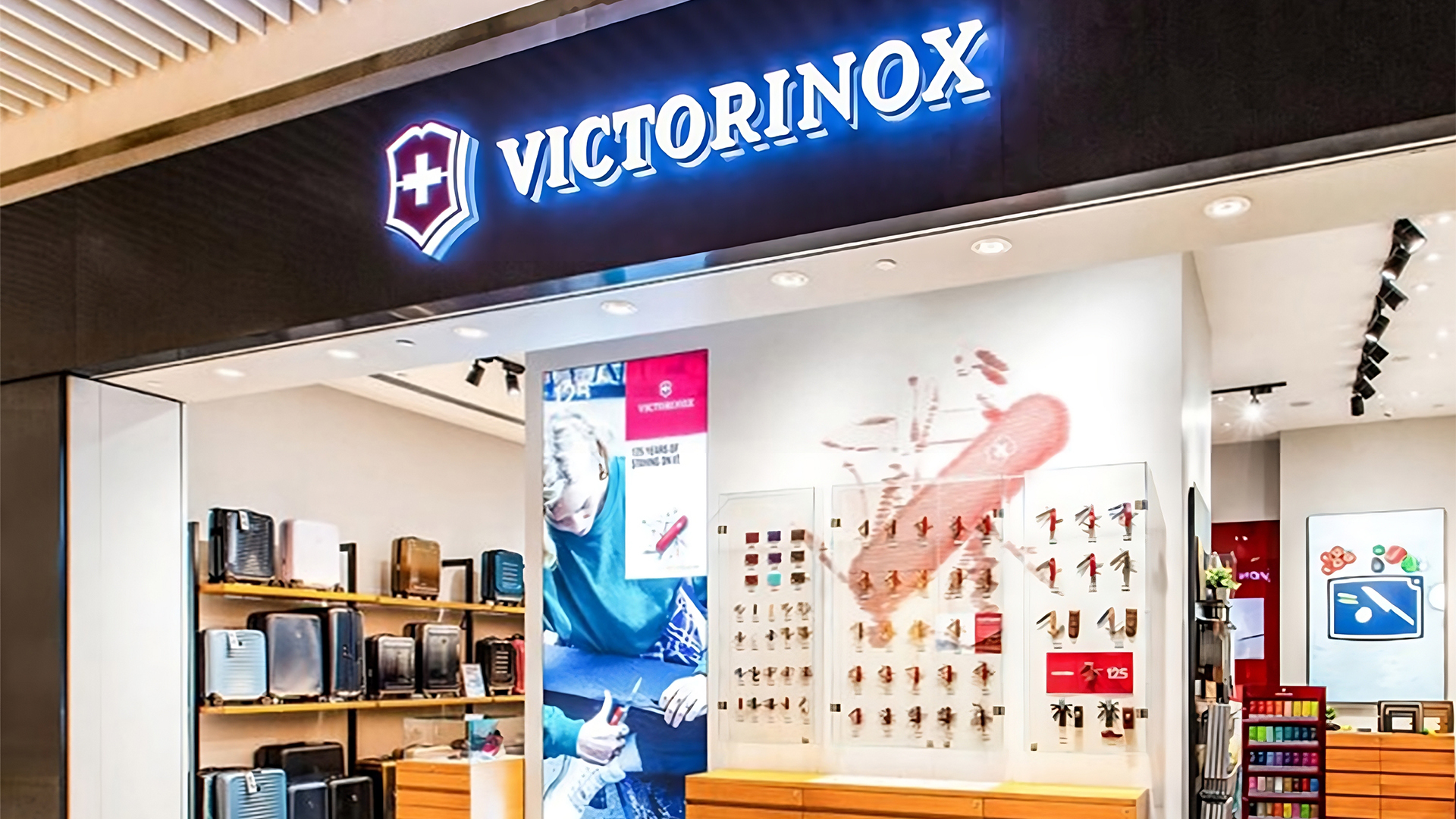
The Victorinox flagship retail showroom was carefully crafted with bespoke cabinets and display units that showcased the brand’s full range of products. The custom-built fixtures and floating panel display within the store are prime examples of balancing form and functionality to save valuable floor space.
3. Use lighting effectively
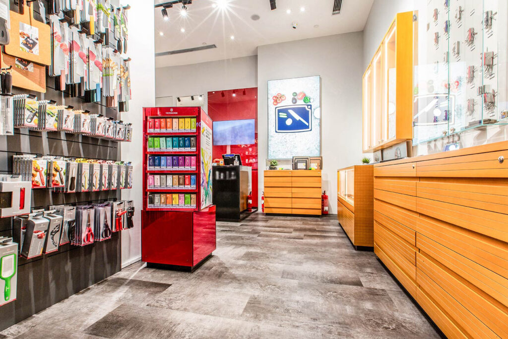
Lighting is an integral part of retail interior design that can either make or break the customers’ experience. Effective use of lighting boosts the atmosphere, draws attention to products, and creates a welcoming and inviting environment for customers. On the other hand, bad lighting that is too strong or dark can make it difficult for customers to see the products clearly, leading to frustration or missed opportunities.
Warm and dim lighting creates a cosy ambience, while bright and white lighting energises the space and attracts attention. Lighting can also highlight products and create focal points within the store — illuminating products with strategic lighting draws customers’ attention to specific items, increasing the likelihood of a purchase.
The Victorinox store employed bright lighting to ensure customers have clear visibility of each product and its various features. The well-lit environment enhances the overall shopping experience, making it easier for customers to explore and appreciate the features of the merchandise effortlessly.
Meanwhile, the IKEA Tampines and Alexandra showrooms strategically incorporated warm lighting to evoke a cosy and homely ambience, allowing customers to envision themselves living in the space. By creating an inviting atmosphere reminiscent of a comfortable home environment, customers are able to emotionally connect with the showroom and its products which will ultimately stimulate their desire to make big-ticket purchases like a sofa or table, or even something small such as a pillow or decorations.
4. Follow brand guidelines
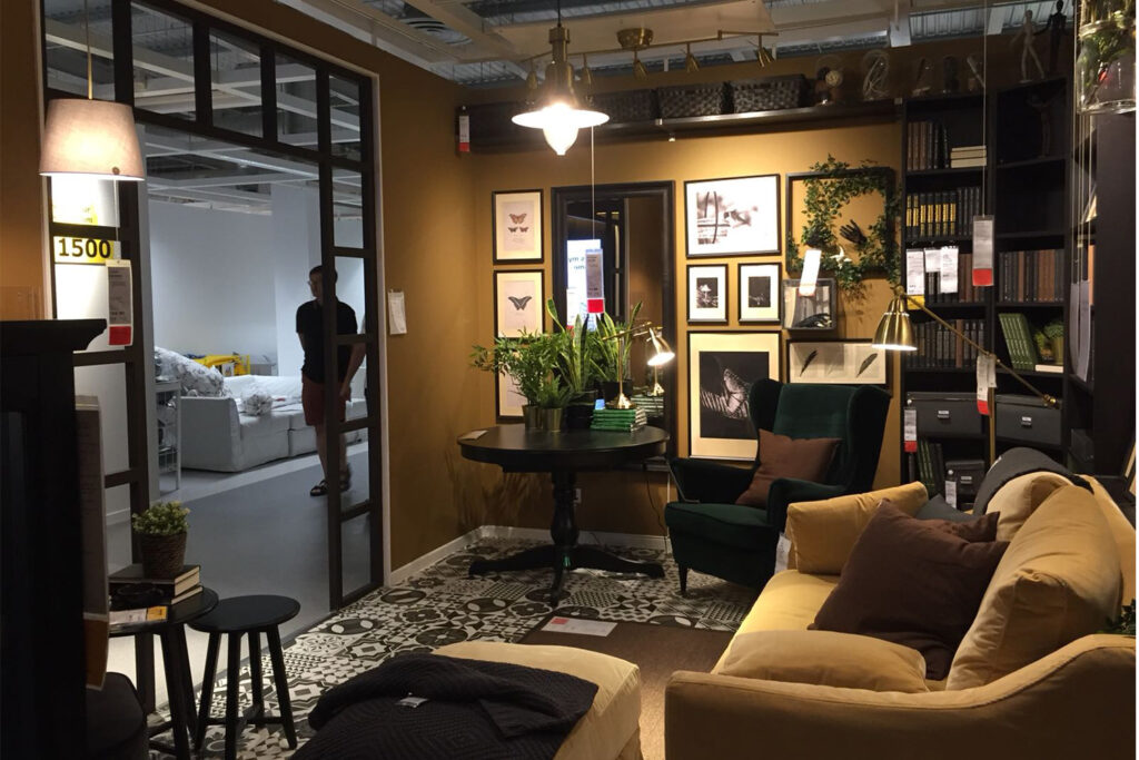
Following brand guidelines is a significant aspect of retail interior design. It is necessary to bring together a cohesive and harmonious environment that reflects the brand’s personality, values and aesthetics.
A well-executed brand identity creates a unified look and feel that customers will recognise and associate with the brand, regardless of where they are in the world. A distinctive brand identity serves as a powerful tool for differentiation, allowing a company to stand out from its competitors and establish a unique position in the industry.
Design elements such as colours, textures and materials play an important role — for instance, fast-food chain McDonald’s is known for its iconic red and yellow colour scheme, which is used consistently throughout its branding and store design.
The IKEA Tampines and Alexandra showrooms were curated to reflect the brand’s signature aesthetic of simple and modern designs, boasting clean lines and neutral colour palettes. Each showroom was furnished with seasonal furniture to create an inspiring and welcoming environment for shoppers. Despite following the same brand guidelines, each showroom had its own unique character and layout, tailored to the specific needs and preferences of different customers. Overall, the retail interior design of the IKEA showrooms is a testament to the company’s commitment to creating functional and affordable furniture and home decor products, while also providing customers with a visually appealing and pleasant shopping experience.
Form follows function, but style never has to be compromised
Finding the perfect balance between form and functionality is a never-ending pursuit. While it is essential to create a space that is practical and serves its intended purpose, it is equally important to consider the aesthetic and overall style of the space. Ultimately, form follows function in retail interior design, but style never has to be compromised.
At Dezign Format, we believe that commercial interior design in Singapore is not just about making a space look beautiful, but also about optimising the space’s functionality to ensure it meets every client’s needs.
Our team works closely with clients to ensure their vision is realised while also offering valuable insights and recommendations throughout the entire process.


